


YORA
Redesigning an online claw machine web-application with a different business model compared to conventional claw machine applications in the market.
OVERVIEW:
A new business model has been introduced to an online claw machine platform. Our team aims to increase player retention rate by introducing a new onboarding process, and a design system for consistency throughout the web application.
BACKGROUND
PROJECT TYPE
DELIVERABLES
Group Project (Pro-Bono), 3 weeks
Web-Application,
Game (claw machine)
User Interviews, Affinity mapping, Competitive analysis, Customer Journey, MoSCoW, Card Sorting, Site map, User flow, Design System, Usability Testing, Interactive Prototypes.
My role:
UX Researcher
UX Designer
UI Designer
RESEARCH
Background: Yora Mobile Virtual Arcade is a mobile web application that seeks to provide users with a nostalgic and memorable virtual experience by emulating the real arcade/amusement gaming experience.
Stakeholder interview: A brief with three task was given to us by our client prior to the first online meet up.
-
Investigate the reason(s) for existing players dropping off after the free gameplay.
-
Increase the number of users that continue playing after finishing initial free plays.
-
Understand the sharing behaviour of claw machine users.
We decided to kick start the project with a stakeholder interview to understand:
-
What decisions were made and implemented to accomplish the goals and how were the decisions made?
-
What are some of the design limitations or technical restrictions we have to work with?
-
Who came up with the designs for the current web application and if there is any design system we can tap on to increase our efficiency and remain consistent with the current design in the design process?
With the help of the stakeholder interview with the project manager, we were able to clear some fogs with 2 main concerns.
Decisions were made from assumptions. The web application was never tested with users and efforts made were ideas the PM / CEO think might work.
There is no design guidelines, our client are persistent with the look and feel of a dark background with neon purple and neon pink elements and a working file was left behind by an ex-intern designer that screams inconsistency throughout the designed pages.
Decisions: We have to first verify the existing assumptions made with a research plan and look for useful insights to inform our client on the impact of their previous ideas and efforts as well as come up with best probable solution to increase player retention rate, and come up with a design system for us and future designers to remain consistent while working on different screens and to increase efficiency for future designers as well. Time was tight but we got to prioritise.
“
Assumptions are everywhere, we need to verify, timebox ourselves and prioritise.
”
Efforts made: Together as a team, we tackle the problems together with some of the skills below.
Client Management: Our team list out a "Must-Do" activity and "Could-Do" activity and update the client on the deliverables and artefacts that would be handover by the end of the project. A short zoom meeting was held at the end of every week to go through what we have done for the week, what decisions were made and what were our immediate next steps for the following week.
Time management & effective communication: All activities are time-boxed and progresses were updated daily at the end of the day.
We constantly update each other on what we have completed, what roadblocks were met and what efforts were made. We help each other should anyone be stuck at a certain activity to make sure we move together as a team.
Facing Weakness: Upon discussion, we realised that all three of us were stronger in our research ability and weaker in our designing skills.
For this project, I decided to face my weakness and opt to take charge of the design portion. Lots of research was done regarding design guidelines and application conventions as the client have future plans of scaling the web app into a native app.
Delegating work: Activities such as user interviews and usability testing were split across the team according to the work we have on hand and strength of team members to maximise efficiency. After the activity, we group back together to analyse the findings together such as research synthesis and affinity mapping to make decisions and ideate accordingly to the insights.
Close knitted working relation, mutual respect, encouragement and strong support were crucial throughout the whole process, which increased the probability of our team producing good quality work.
User Interview: We did User Interviews with 5 players who have online claw machine experience and 5 players who have only real-life claw machine experience to
-
Identify users' potential pain points and frustrations when playing (online) claw machines and
-
Discover users' motivations and purpose for playing
The same group of players also did a Usability Testing on the current web app to
-
Verify if the assumptions and efforts made by previous PM / CEO is working and
-
Understanding the behavior of first time users
-
Identify misunderstandings users might have with the new business model implemented.
Affinity Mapping: Affinity mapping was then used to organise and group findings according to trends. We prioritise them into primary and secondary insights.
The primary insights were gathered through what majority of users commented on while secondary insights were comments made by interviewees and was kept in mind as these insights had an effect on the gameplay.
PRIMARY INSIGHTS
Attracted by prizes:
Users are motivated to play when there is a chance to win the prize they want.
Enjoying the journey:
Users are motivated by goals requiring certain level of skills and luck to accomplish
Plays on a whim:
Users plays on a spontaneous urge, such as seeing a claw machine in the mall
Pricing matters:
Users are influenced by the pricing and would calculate if it is worth spending on.
Plays a variety of games:
Users have exposure to other online games, therefore are used to common game format.
SECONDARY INSIGHTS
Game controls are important:
Users feels that confusing game controls greatly affects their mood, especially in time constraint games.
Machine layout vs players skills:
Users compare the machine layout (types of claws and toys positioning etc) against their skills before playing
Embarrassed to share gameplays:
Users feel embarrassed to share game plays on social media and would only share with close friends of common interest.
Motivated by free incentives:
Users are motivated to try out new game applications when there are free incentives especially before cultivating the habit of constantly opening the application.
Rainbow Spreadsheet: Rainbow Spreadsheet was used to organise and group findings according to Usability Testing results. It helps us quickly understand what is crucial and would pose a serious impact on the game play experience.
USABILITY TESTING INSIGHTS
Unnoticed / Misleading UI:
Users missed out on certain UI or had confusion about functions of certain UI elements.
Unclear usage of currency:
Relationship between the currencies and the game play was not established properly.
Insufficient filters in sort function:
Categories were not specific enough to narrow down the long list of prizes available.
Misunderstanding due to convention:
Users had the conventional impression that they would be winning a specific prize with each successful catch
Lack of motivation to share gameplay:
Users are not inclined to share unless it showcases a rare prize or a prize that was won at a steal.
Additional insights: There were multiple insights regarding the attractiveness of the prize, the pricing of each plays and machine layouts, upon discussion with the client, it was a business model they would like to keep. With that, we choose to focus on the insights that we can leverage on or make changes to.
Competitive analysis: To identify baseline features and potential feature we can include in the webapp, we conducted competitor analyses against 3 other competitors, which were either previously used by Yora for analysis or were mentioned and played by interviewees.

FINDINGS
-
New User Free Plays
-
In-game currency
-
Daily Free Reward
-
Shipping
-
Personal Profile
-
Sign Up/ Sign In
-
Onboarding
-
Customer Service
-
Prize Redemption
Baseline Features:
-
Queue system
-
Sharing of successful game play videos
-
Game Speculation
-
Incentives with every advertisement watched
-
Customer service/ Feedbacks
Potential Features:
SYNTHESIS
Customer Journey Map: To better understand the whole process experienced by users, we came up with a customer journey map, which depicts the stage, the action that is taken by player, how they feel at each point of time and identify opportunities for us to optimise the experience.
It starts off with discovery and testing, where the player finds YORA and creates an account and collects the daily free incentive before starting to play.
It then moves into purchases, where they buy game currencies, and follow by prize collection, where the tickets are used to redeem a prize.
Finally, they go into delivery and sharing, where they arrange for shipping and post on their social media when they receive the prize.

How Might We: HMW statements were formed to focus on the problems our users face and to keep both our team and the client aligned during ideation.
HMW:
-
Assist players in locating and saving his/her desired prize?
-
Enable potential players to discover YORA?
-
Improve the interaction with game controls?
User Interviews
HMW:
-
Implement digital conventions?
-
Establish the relationship between currencies and gameplay?
-
Specify filters in the sort function?
-
Introduce Yora's ticket system to users clearly?
-
Incentivise users to share about their YORA experience?
Usability Testing
IDEATION
Feature Prioritisation (MoSCoW): Using the information we got from competitor analysis, we carried out feature prioritisation.
Features under "Must" were obtained from baseline features in the competitor analysis that answers to our HMW statements.
Features under "Should" were obtained from competitors baseline features as well, but has less impact on our users according to the HMW statements.
Features under "Could" were potential features that were present in some of the competitors and were not common across all apps, or features that could not be supported due to technical limitations.
Must
-
Paid & Free Currencies
-
Game Controls
-
Navigation Footer
-
Account / Profile
-
Delivery
-
Onboarding
Should
-
Customer Service/ Feedback
-
Wishlist / Favourites
Could
-
Sharing of successful catches game play
-
Game Speculation
-
Watch Ads for Incentives
INFORMATION
ARCHITECTURE
Hybrid Card Sorting: Going back to one of the HMW statement, we want to find out how players sort prizes into more specific categories to locate their desired prize. After discussing with the client, a decision to carry out a hybrid card sort was made to identify how players associate labels with items according to its given names, and to potentially discover new labels as well. There were three key findings.
Multiple Categories:
Some items fell under more than one category due to the product given names.
Visuals:
Items need correspoinding pictures for a visual representation.
Usage:
Items were grouped according to their uses. (E.g. Digital items = Electronics)
Site Map: With the research results and the existing navigation system, we come up with our sitemap, which consists of 4 major tabs that focus on the main features of YORA.

User Flow: After finalizing our sitemap, we created a user flow to better visualise how YORA users would carry out the process from signing up/ login to arranging for delivery and shipping.

SKETCHES & WIREFRAMES
Sketches: With the results and analysis, we brainstormed and came up with ideas that would help potential Yora users and meet the goals set by Yora. I then created some sketches with the ideas so that the client can have a better visualization.


Wireframes: After getting approvals and some changes to the ideas, I then come up with wireframes to identify elements that needs to be created and would be used constantly in the later part of the designing process for my team to work on.

Design Guildlines: Without an existing design system in place, I had concerns regarding inconsistent designs which was also pointed out by our interviewees. It also jeopardize the credibility of YORA.
I proposed to come up with a simple design system for us (and future designers to iterate on) as it can ensure uniformity in our designs and increase efficiency by reusing elements and components.
DESIGN SYSTEM
Color Scheme: The client wants the neon purple and neon pink colors on a dark background to introduce a techy arcade vibe. He also shared about the future goals of making the web app into a native application. With this theme and future goal in mind, I did some research on Google Material regarding the recent trend of "dark mode", a commonly used feature on phones and even on some computer applications. Due to the contrast issue on dark background, I shifted the category of their primary pink and purple to primary variant color and introduced an unsaturated version as the primary color instead. Their original color scheme on dark background has lower contrast and can strain users eyes, causing a negative effect to the users experience.

Typography: We notice that there is a inconsistency of fonts used throughout the current live web app which might be due to improper handover or miscommunication with the use of more than 3 fonts. To minimise inconsistency, we chose a more acceptable and commonly found font in both iOs and andriod system (Montserrat). The difference in sizing, weight and letter spacing was also recommended by Google Material.

Iconography: The Iconography was scaled to exactly the size of the current web app size for designers to use easily. It is also categorized into action icons, supporting icons, and indicator icons.

Pattern Library: The Guidelines shows the design rules of the basic elements as well as the components used in YORA's final prototyped web application. It also has notes indicating how it can be/was used in the final prototyped web app. As there can be times when rules are a form of resistance to a good layout/design experience, thus it was also mentioned to our client that it will be good to follow, but break when there is a reason to.

DESIGN ITERATIONS
Usability Testing: Upon approval from our client regarding the sketches and wireframes, we proceed to do our first prototype. We then conduct a total of 2 rounds of Usability Testing with 10 players in total with online and arcade claw machine experience to evaluate our solutions and identify usability issues with the prototype.
Players were briefed for each task and they interacted with the prototype and attempt to complete the given tasks. We used the rainbow spreadsheet method to synthesis the usability test findings incorporated the findings into our design improvements
SEQ RESULTS
SEQ Results: SEQ was done to evaluate the ease of use at the end of each task. The task given was kept consistent with Usability Testing done in the initial phase of the project. As shown below, there is an overall increase, especially in the reloading process.

DESIGN ITERATIONS
Major feedbacks and design improvements are summarised as follow.

Before


After
.jpg)

Problem: Participants was overwhelmed by the long and unclear onboarding process. This was due to the lack of connection between the instructions and the screens or elements of the web app.
Solution: We try to shorten the onboarding process and at the same time make sure it brings a clear message to our users. The format of the clunky onboarding process at the beginning is also split into the different tabs and would only "walk the participants" through when the tabs are clicked on which allow participants to connect the instructions given with the screens of the web app.
Before
Problem: Repetition in copywriting causes a slight confusion/delay on which machines could be used. Relationship between toys and ticket wasn't clear to the participants. There was also a lack of indication in the different machines and credits used to play in each machine.
Solution: The presentation style of the machine is changed to indicate the catching of tickets and the play button is removed from occupied machines to reduce confusion and additional information of credit used is added for clarity.

After

Before
After
.jpg)
Problem: UI elements or components goes unnoticed as it blends into the background. Participants were also unaware that prize details could be viewed by clicking on the list cards as there was a lack of indication.
Solution: The UI elements was made more prominent while adhering to the design guidelines. The presentation style of prizes was changed like prizes on carnival shelf and participants instinctively click on the prize to find more details of the prize.
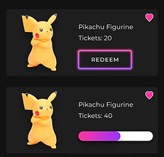
Before
Problem: Participants understood how to track ticket collection progress but could not visualise the bar changing into a redeem button when sufficient tickets were collected.
Solution: A simple onboarding process is added to users who clicks into the prize for the first time to enable better visualisation for users.
.jpg)
After
.jpg)


Before

After
Problem: Participants expressed confusion on overcomplicated icons. The initial camera flipping icon leads participants to think it would record their expression while playing the claw machine.
Solution: The icon is simplified and with the existence of the words, it was sufficient for participants to understand the usage of the button clearly.
Before
Problem: Participants felt discomfort as the initial writing feels forceful to store information on the platform in the checkout process.
Solution: The copy is changed to accurately reflect the intent with actionable words in first-person point-of-view.

After

OTHER FINDINGS
Other findings: Throughout the Usability Testing, there were other findings that were prominent but were not solved as it was out of our scope to iterate on.
Hesitant to pay in USD:
Participants think that USD is more expensive and inconsistent due to exchange rates and viewed it as an indication of a non-local business.
Recommendation:
Usage of SGD to gain trust in potential players in Singapore.
Toys in claw machines:
Due to the new business model, the toys caught in gameplay does not equate to toys available for redemption. The existence of toys in claw machines causes slight confusion even after in introduction to the onboarding process.
Recommendation:
Usage of objects that can be clearly identified as tickets or elements found in carnival games. E.g, catching of ping pong balls or tennis balls.
Enticed by skills and luck:
Participants are motivated when they can level up or go through a challenging process or journey.
Recommendation:
Introduced a form of levelling system or scoreboard to entice users to level up and compete among the claw catching community.
Lags or bugs convey instability:
Instability or lags affected participants' trust drastically in the game system.
Recommendation:
Allow users to feedback on instability or bugs discovered and gives incentives for it as a form of appreciation and confirmation that their voices are being heard.
Rarely share their gameplays:
Participants were reluctant to share their gameplay, especially on their social media as they were embarrassed and would not like to be judge by the eyes of the public.
Recommendation:
Participants feedback on the attraction to incentives. Giving incentives after sharing on their social media platform or upon successful invitation of new accounts can greatly help the platform spread through word of mouth.
What is next? With every project, there’s always room for improvement. Given more time, we would love to conduct more usability tests to validate our iterated design.
As we had time restriction, our current prototype only includes the minimum screens Yora players will get in touch with, thus we would like to propose for other screens to be redesigned to fit all the touchpoints of a Yora player - including the shipment process.
Proposed next steps: In our next step, we also proposed to test out different levelling system to entice players to continue playing, as well as changing of toys to balls or other sorts of carnival games to have a more obvious differentiation between Yora and other online conventional claw machines in the market.
As mention earlier, only working files passing down from different designers are not enough and inconsistency in look and feel of the web app can cause players to shun away when deemed as a shady website. Even with a simple design system can help greatly in the consistency and efficiency of designers.
My takeaways: I learnt to step out of my comfort zone to do things that I am weak in. I also make sure to communicate often and update on the things I complete so that I do not hinder my teammates working process.
Here’s a big shout out to my awesome teammates Lydia for being the point of contact between us and the client as well as Vera for covering Lydia and I when we needed extra help.
